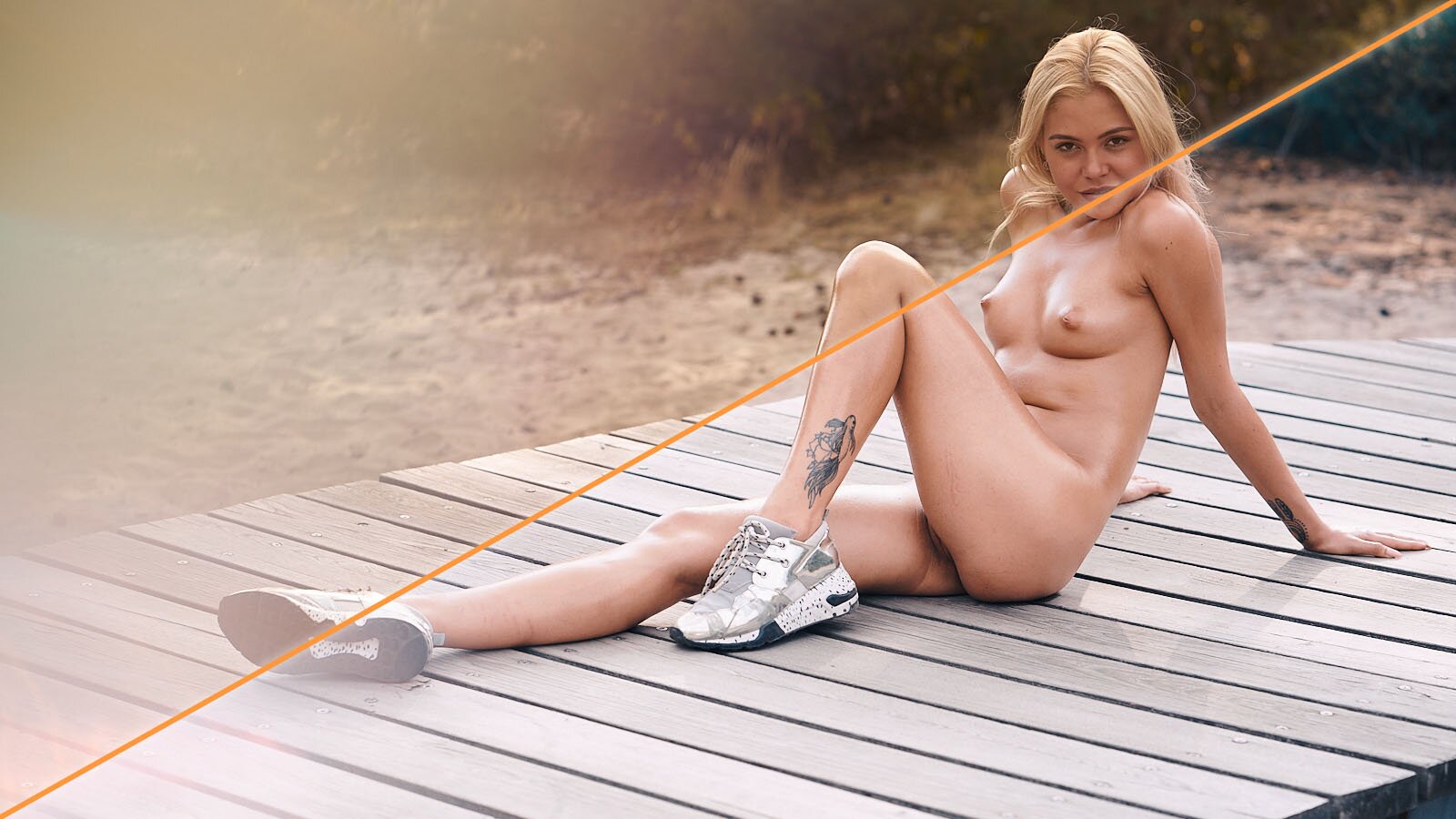
A photograph is not finished when you release the shutter. And the post production process even takes longer than the actual photography. It has already been like this in the early days of photography when retouch was done manually during and after processing film in the dark room.
And it still counts today. For both, black and white and color photography. You transport a certain message revealing specific colors. Contrast and saturation matter just as much as the overall color palette that you use.
All of this is a lot of work. Therefore photographers are secretly hoping for the cure that solves all problems at once: Make my photo look good (or better) by the click of a mouse button. Preset manufacturers keep telling us about the rocket science they put into developing their style and that you can make any photo look perfect at once. However, in practice this appears not even to be half true.
And I speak from experience. I have bought several preset packs and always was disappointed. I'll tell you why.
Photographs differ very much. Shot outdoors on a bright sunny day is something totally different from taken inside a living room on a rainy day. The range of colors that appear in the images will be simply different.
And it sure makes a big difference, too, what type of images you have when applying a preset. Many of those have beautiful wild landscape in the advertised demo pictures. But in a classic portrait shot, you won't have any green tones at all. The majority of colors will be red and yellow due to skin colors.
So what I'm saying is: Presets can always only be considered to be a starting point for your color grading. And if they are, why not work things from scratch?
Your photographs are too individual to get enhanced by a pre-manufactured preset. Better learn understanding colors.
Some might argue, they have hundreds of images to show to a client. Good point. I usually make my settings in Capture One and then copy those settings to the whole preselection.
I decided to give you an example of how I work with color, step by step. This is not the only way to do it. Neither it has to be the best. But the process works well for me. See for yourself:
Example 1
I shot Chiara only with available light from the bathroom. It's a bit too yellowish for me from the warm light bulbs. So, I pushed the white balance to 200 degree less. I slightly raised the exposure and added contrast and saturation. As the towel around her head was blown out, I brought back a bit of the whites using the high dynamic range setting and also lifted the black point slightly. The last thing I did, was adding a tint of red in the dark parts of the image. Just a small bit, so you can feel it but don't really realize it. All changes are subtle.


Example 2
The day I photographed Sylphsia was the hottest day of 2019 in Frankfurt. In the original image, you can't really tell. It looks greenish the way German nature looks. But I want the photograph to show what I feel. And I felt brutal heat. Therefore I pushed the white balance all the way to 9900 K and in the white balance tool itself, I dragged the tint to the red scale a good portion, too. Then I lift the exposure and brightness and add contrast and saturation. Now, the greens are still not the way I want them to be. So, I used the color editor tool to move the green tones towards a more yellow tone. By adding a small vignette, I make the model stand out a bit more.


Example 3
Here's one with extreme lighting. I photographed Julia in a small movie theatre. With a bunch of adapters, I was able to connect my Macbook to the movie projector. And I projected the Sublime logo on a pink flower blossom background (that I shot in Portugal). I used no other light than the movie projector and therefore I had to shoot at ISO 5,000. As I knew this was going to get printed large in my book (not this particular shot but similar ones), I underexposed on purpose, so I did not have to go all the way up to ISO 10,000 or so. In post, I lifted the exposure and brightness up. Then I concentrated on the skin tone on her face. Actually only the small stripe of skin that should look appealing. I added red saturation and changed the white balance until I had found a pleasing tone. This time I used an opposite vignette to actually brighten the corners a bit more.


Asking yourself what you want to achieve and why, is the most important thing when working with colors, I believe.
When you use presets, you let others decide how your image will look. And this feels totally wrong to me.
Working with colors is such a wonderful thing to do. You can only benefit from creating your own mindset on colors and from developing your personal workflow.
