Oliver is a great guy. We studied together. So I know him for 20 years already. Damn, that's making me feel old. I know where he's good at. And printing definitely is his expertise. He is married to Adobe and their programs. So, he's my partner over years.
When it comes to layout, I really know what I want. I don't want it to be too fancy. While I am generally very much for the Zeitgeist in design, in a book production, I am rather conservative. Large images, that's what it's all about for me. This is the reason why I buy photo books, because photographs that appear in big size on a nice paper, feel much better than the thousands of pictures we see on screen everyday.
Size matters. When it comes to photographs, I am sure, you're with me.
I really like some crazy layouts that I have seen by other photographs. But what looked fancy ten years ago, is just boring or even embarrassing today. If you need an extraordinary layout for your book, maybe the images don't speak for themselves? So, my decision definitely is to keep the layout consistent, interesting, but simple. No distraction from my images needed.
This time, I had some deep thoughts whether I needed page numbers or not. It's a common thing, most books do have page numbers. My first coffee table book had page numbers. But as I did not want to print them over a photograph, they were only present on every 20th page or so. Does that make sense? Not really. I decided to throw them out.
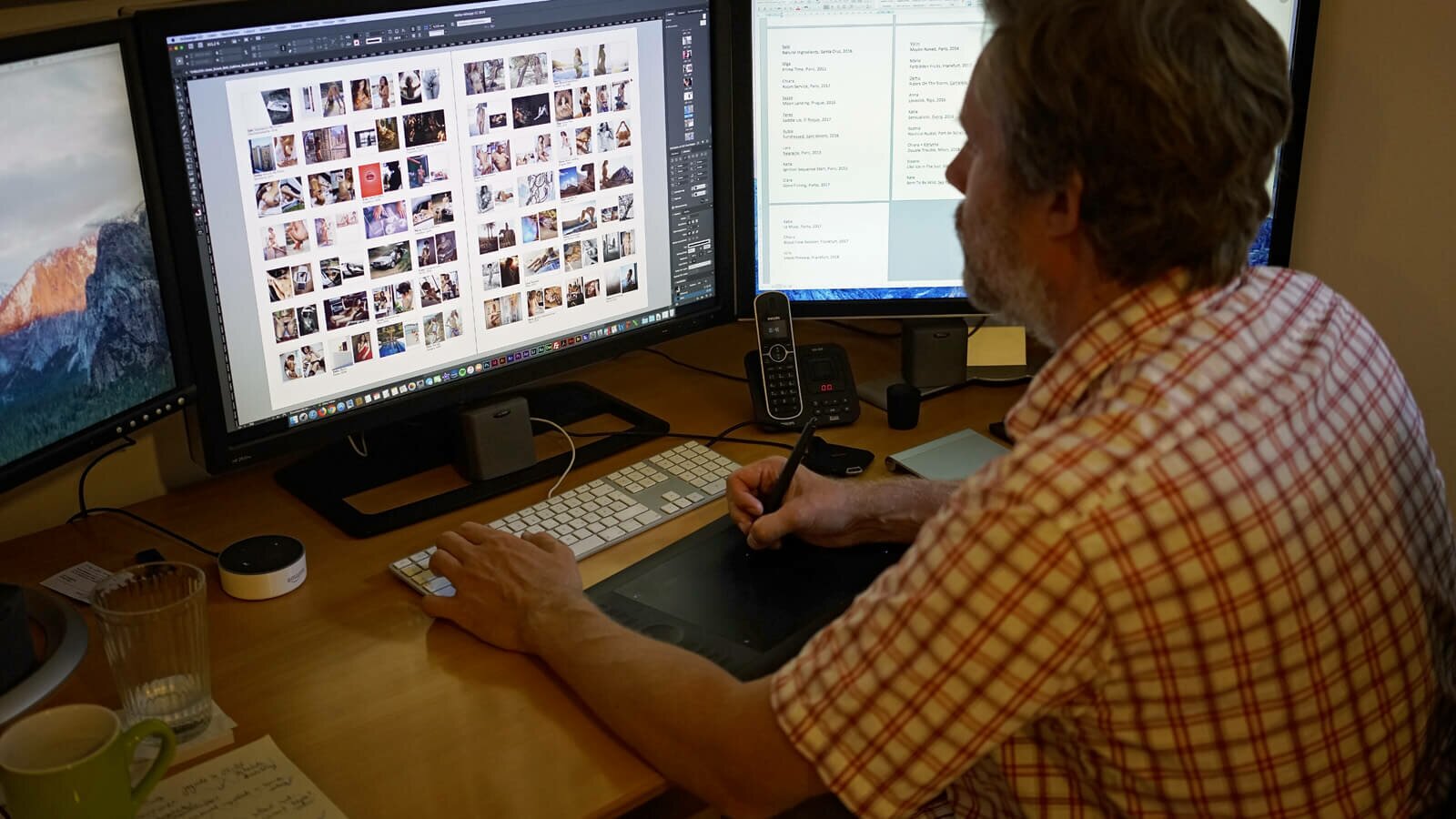
Like last time, I do have an index at the end of my book. You can see thumbnails of the whole book and the name of the models as well as the cities and dates when the pictures were taken. This is a nice compromise, I believe, so I skipped the page numbers for my new book.

On the other hand, the least thing that I want is to bore my audience. Come one, repeating yourself is a pain in the ass. So, Sublime will be different from Frisky. Similar as it's a family, but still different.
Not fancy layout-wise, but also with big photographs, almost always full size and allowing them to speak for themselves. What's new is that I already knew the size of the book from start, so I could keep this in mind when creating spread images, in landscape format. You will be able to tell the difference.
In Sublime there will be far more spread images that fully cover both pages. This makes me happy.
Sublime is the same format, same thickness as Frisky. With my last book I created a book that you like to browse through. Being neither too short nor too long. It's a book that will fit in your shelf, still stand out. And it's a coffee table book, perfect to show off in your living room, if you like.
What I am a bit proud of is that you can see a development in my work. I personally feel that erotism in my pictures is more subtle now. But more intense. Working on the edge as always. Which is the reason why I am so happy I succeeded.

After checking and re-checking the layout over and over again, eliminating the tiniest faults and driving Oliver crazy with my demands (e.g. moving a line 0.02mm further up, sorry Oliver!), the final PDFs have been produced. The files size of the PDF is 537 megabytes and it's now being proof printed in the printing house.