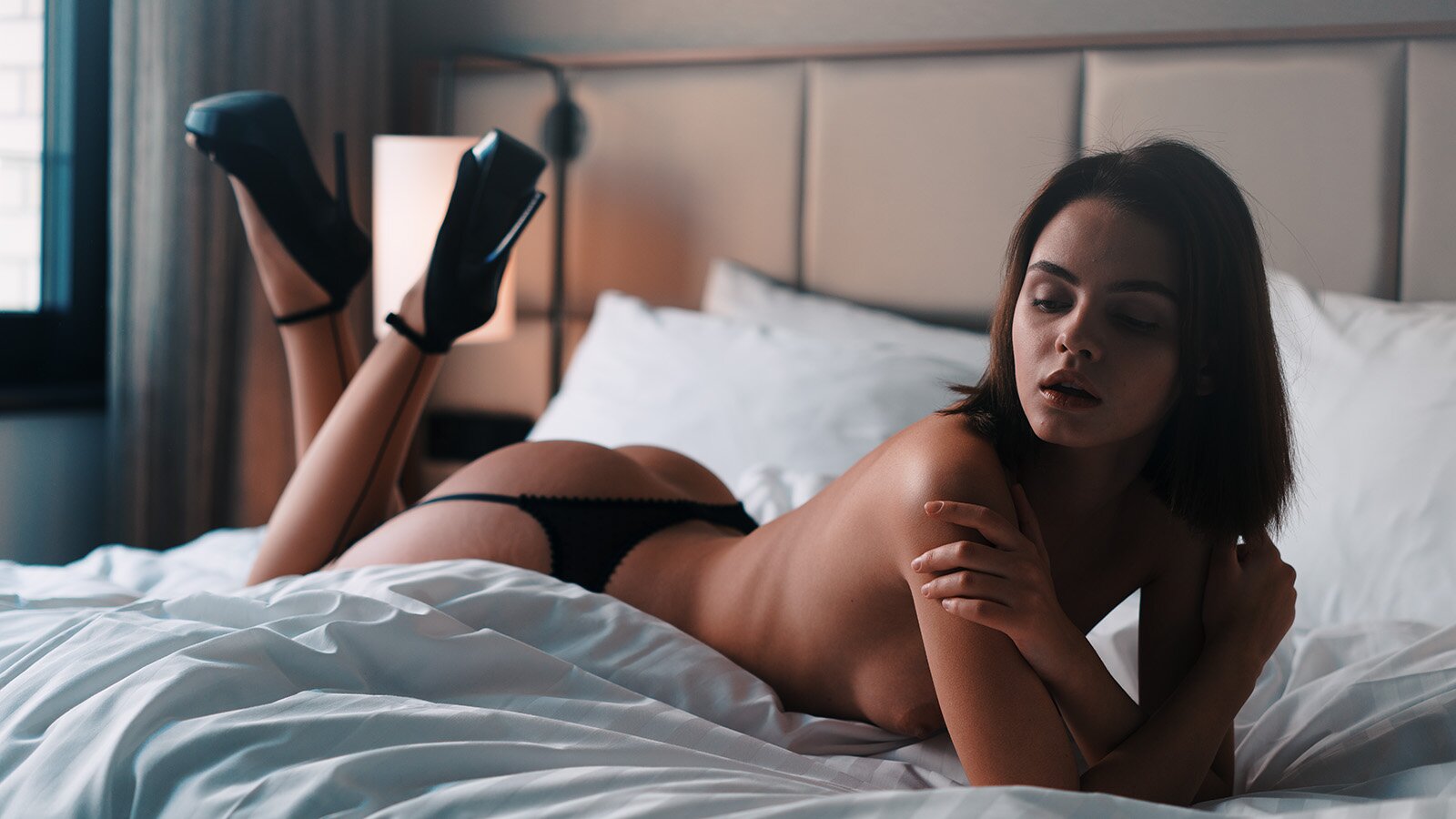
I discovered that back in art school I learned the color theories that were taught in the famous Bauhaus university in Weimar. When I was a student, I did not care much about this. But I remember those afternoons where we were in the assembly hall of our school and mixed all sorts of paint. We painted large piles of paper in different shades of each color tone from the color circle.
We used these papers to learn color science and theories. Basically to understand how we receive colors and why. Even people like the famous scientist Newton or the writer and poet Goethe cared about the color wheel and drafted their own ones. The theories we were taught are from the Bauhaus professor Johannes Itten. His book is called Kunst der Farbe (Art of Color) and I just read it again after twenty years.


We all know the color wheels from Photoshop, but it helps to have a look at the one drawn by Johannes Itten. He defines only 12 primary colors and later explains the different effects that colors have once they are seen side by side.
As I wanted to understand the orange and teal combination, I only looked for sections in the book that took care of this. He didn't call the colors orange and teal, but that's the name of the look today. Basically, it is a warm orange on one side. A color that you see on skin in the golden hour (before sunset). And there is teal. A medium blue-green tone.

I assume, I have mentioned this before one day. It's all about contrasts in photography and design. And one of the major contrasts you can get is using complementary colors. Those sit on opposite sides of the color circle, making it clear, they are direct counterparts.
It is all about the use of complementary colors.
The reason orange is part of the look has to do with skin color. If we were martians, the look would probably be called lime and magenta. But our skin tends to go towards orange when we're tanned or lit by warm sunrays at sunset. Of course, there are other skin tones, too, but the trick of the orange teal color grading also is to reduce the color palette to match all colors in ranges of these two colors. So everything greenish will go to the teal section, every color from yellow to red spectrum to the orange section.
Our brain asks for these complementary colors and creates them by itself. And this is the interesting part about the color theories. There are nice videos on YouTube, showing examples. Check out the one below and you can experience the color grading capabilities inside of us.
- Warm and cold contrast
- Light and dark contrast
- Quality contrast
While the first two are self-explaining, the quality contrast means, each color has a certain vibrance. Orange is more vivid, more energetic. And therefore if you put orange and teal side by side, they add spatial depth and stimulate each other. It is hard to put in words. But this sums it up: We feel colors rather than seeing them. I find this super interesting.
Universal look?
You can add an orange teal look to indoor and outdoor images. It will add depth to the pictures as we are used to shadows receiving blue sky light and highlights are receiving orange sunlight. When grading like this, it seems to be removing an overall color cast, too. But for the most part, if you can tell it's been done, it has probably been overdone.
Some people say this orange and teal color plague is ruining the american cinema. The so-called blockbuster look has simply been overused. And our brain also likes to get surprised. Also, it would be very strange, if one specific way of grading could work for every scene. Speaking about a lack of understanding the figure/ground relationship.
Therefore, in my works, orange and teal is always present from a starting point. But while working with the photos, I automatically move away from the base. Sometimes more, sometimes less. Here are some examples where I took my photos and applied a decent orange teal look to them. It works. But I never graded the pictures like this.
Looking at the images from Sublime, I realize, there's not one typical example of a pictorial with the specific orange teal look. Of course, I used the contrasts, e.g. in my series with Lara in Paris (Nearacle). But the colors were there, I did not artificially force my series to adapt to the orange and teal look. And I wish, they were using it less in cinematography, too.


