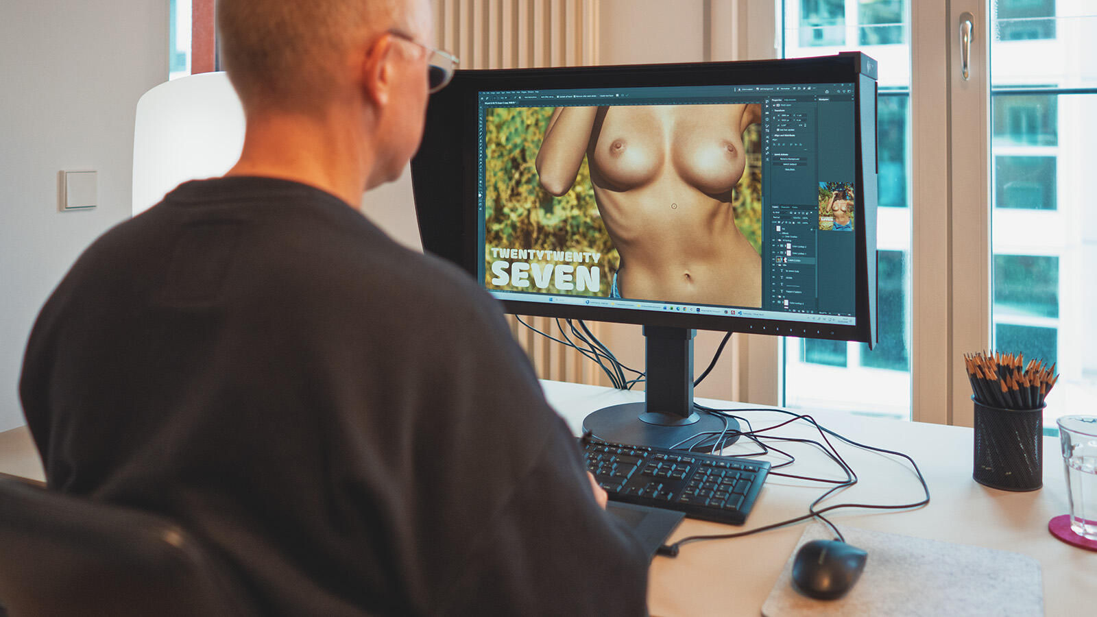
I've been putting out my calendar for 19 years now, and every single time I catch myself spending days in front of the screen, weighing individual images against each other as though something world-historical depended on it. Maybe it does, at least for me. Because in a calendar, every image has to stand completely on its own. Not as part of a series, but alone, for an entire month, on someone's wall. That demands a different quality of attention from a photograph.
Three weeks of work, several hours a day. I look, I reject, I sleep on it, I look again. Some images I'd confidently cut on day one suddenly rise to the top by day ten.
With 67 candidates, the first round was relatively painless. Too loud, too similar, too much bed. But then, when I'm down to twenty images and need thirteen, things get ugly. Every decision against a shot feels like a small defeat — like telling a photograph: you were good, but not good enough. It doesn't help that I care about a nice balance between breast and rear shots, which is easier said than done. What do I do with a model where both work beautifully? I stare at an image — glorious backside, wonderful chest — and feel like someone who can't put the menu down at a restaurant. I know: there are problems the world has little sympathy for.
And breast versus rear is actually the easy part. The real work starts when I begin systematically weighing the images against each other. Pose: from the front, from behind, side-on, kneeling, sitting, lying, standing in all its variations. And definitely not too many of the same. Hair color. Tattoos or none. The model's background and the location. Indoor or outdoor. Wet or dry hair. Smiling or serious. Soft or intense. Seductive or simply breathtakingly beautiful. Rich color or tonal harmony. All of this runs in parallel in my head while I stare at thirteen rectangles that won't sort themselves. In the end, I go with gut feeling. What I feel when I look at an image after working through all those questions. Completely subjective, I know. But someone has to do it.
The cover image was the quickest decision this time. Petra, cowboy hat, cacti, unbuttoned jeans. The hat was originally a purely practical solution against the brutal midday sun, which has no friends. But the moment I had Petra's full breasts in view, I already knew this would be the 2027 cover.
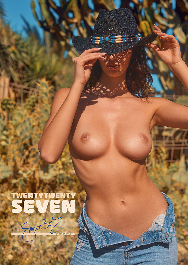
The typography is new this year as well, naturally. Not because the old version was bad, but because I find it tedious to make a calendar with the same typefaces year after year. I bought a new font license, pondered, tinkered, and found myself thinking back to a favorite subject from art school: typography, with a professor who talked tirelessly about treating type not merely as a vehicle for information but above all as a graphic element in its own right. The calendar grid this year has become, let's say, rather decorative as a result. Whether anyone will actually look up an appointment in it is another question. Maybe it's just a good excuse to linger a little longer.
I finished the image selection and print preparation back in March. And while you're reading this, I'm already working on images for the 2028 calendar. I know, that sounds perverse. But it's the only way to have a real selection to choose from later.
The new calendar is available to order now, while the limited edition lasts.