Harmonious color grading refines photos. I love color grading. Since 2019, I have a secret — I color grade my images with LUTs. I now offer these for sale to interested photographers.
What are LUTs?
LUT stands for Look Up Table and in simple terms it is a large table with RGB values of all colors and an indication of how they should change. LUTs are complex color filters, so to speak, with which you can optimize colors extensively in one go.
Originally this comes from color grading in the film industry. Here, flat, almost gray-looking color profiles (e.g. S-LOG 3) are recorded and colors are assigned by LUT only in post-processing. These color profiles have a larger dynamic range and can record a wider range of shadows and highlights.
Here's the kicker!
If it works in film, it must work with photos, I figured, and so I developed my own LUTs that work on normal photos (i.e., no special profiles) and help with color grading.
So you shoot with ordinary settings. Then you click a LUT from me and poof your photo (or video) gets a special look.
Why work with LUTs at all?
Color grading in image processing is generally about two things: a good idea and speed. That's why I fiddled around until I had five good LUTs ready. This way, color grading is super fast without needing other tools.
Cinema aesthetics and sunglasses effect
I got my inspiration from cinema movies. Often I would sit in a movie theater and pay more attention to the colors than the actual content. Sometimes the color grading is overdone (for example in "Amélie"), matching the movie, but not matching my work.
So I've been working on subtle changes to get skin tones beautiful. Since I've been working on this, I'm no longer afraid when I have a completely pale model in front of the lens. Or a tanning salon beauty. Skin tones are now under my control.
When I walk in the sunshine, I see the world through my sunglasses. The lenses are mirrored but have to be tinted yellowish-orange, and sometimes the colors are so insanely beautiful that I'd rather not take the glasses off. The green tones of the trees, the color of the sky. I was also inspired by this, remembered the colors and transferred them to my LUTs.
Shades of color
When you work in barren nature like Fuerteventura, it's relatively easy. Here there are brown rocks, beige sand and all the color values go wonderfully with skin tones. But even here, I like to shift the colors minimally to get them more subtle.
Once green plants come into play, however, it's a whole different challenge. They're welcome to look rich, but natural green, for example in Germany, is just too harsh. Getting nice greens that gently hug you in such photos can be a huge fiddly job. With my LUTs, this problem is a thing of the past, too. For example, I pull dark greens into the bluish, but push the mid-tones more toward a warm yellow-green.
The same goes for blues. They appear in my photos mostly in the sky and water. By nature, they are often not that bad. But with my LUTs, I manage to get the blue even more attractive, so that it's addictive and you want to look at it even longer.
One LUT for all cases
It is in the nature of things that there can be no such thing as a jack of all trades. Not even with LUTs. But what is the use of LUTs if you have to try out 30 different ones? That has always been super annoying with the presets and styles in Lightroom and Capture One. You can't smell 30 different scents in a perfumery either. That doesn't work.
I wanted to have LUTs that are as suitable as possible for different situations. So with just one click each, you can apply five different looks. Whether from RAW, JPG or video.
Achieving sensitive colors
My LUTs are not massive battering rams, not crazy gimmicks like the Adobe supplied LUTs, but they very sensitively make delicate improvements that you can feel without them jumping at you.
Depending on the lighting situation (daylight, flash, tungsten, night, blazing sun, cloudy) and skin type, not every LUT will match perfectly right away. But in the vast majority of cases, one of the five looks tremendously good. Please judge for yourself.
My LUTs in detail
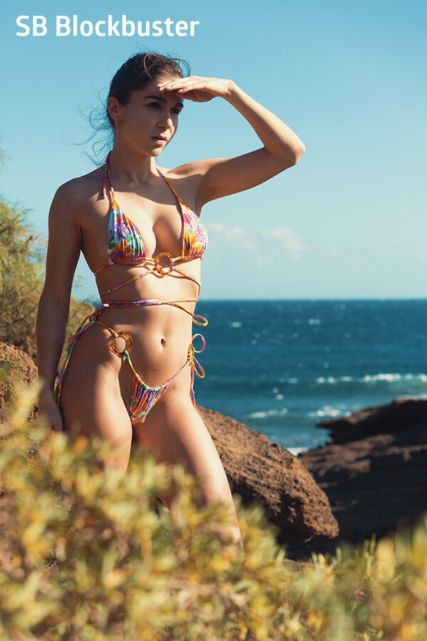
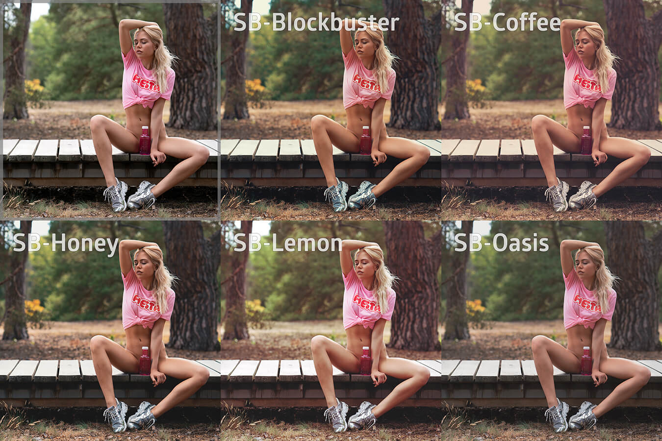
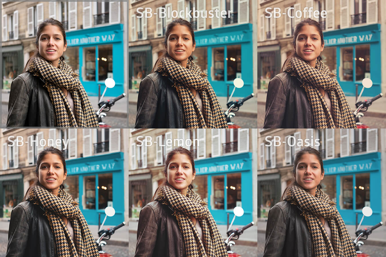
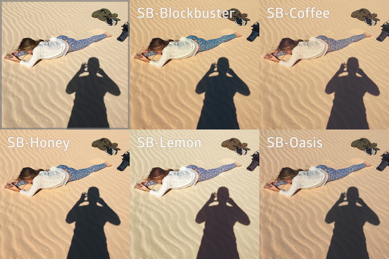
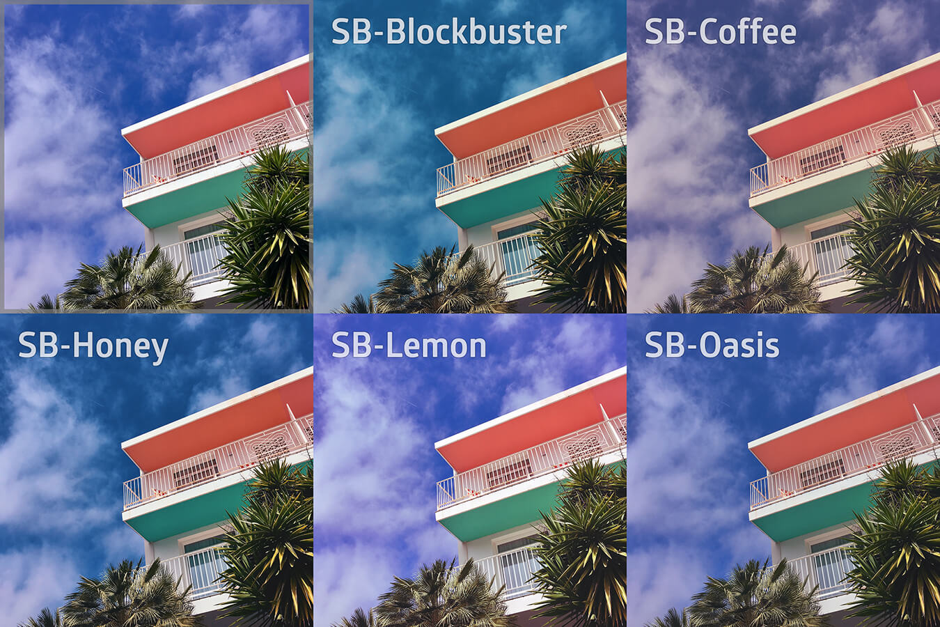
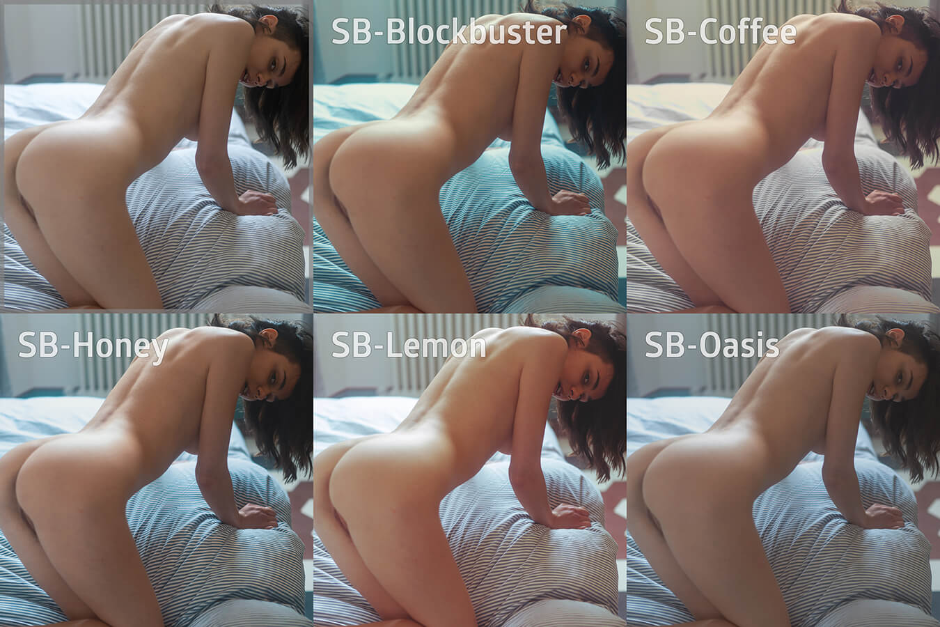
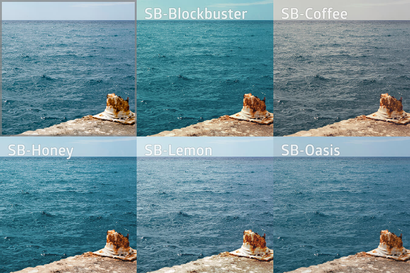
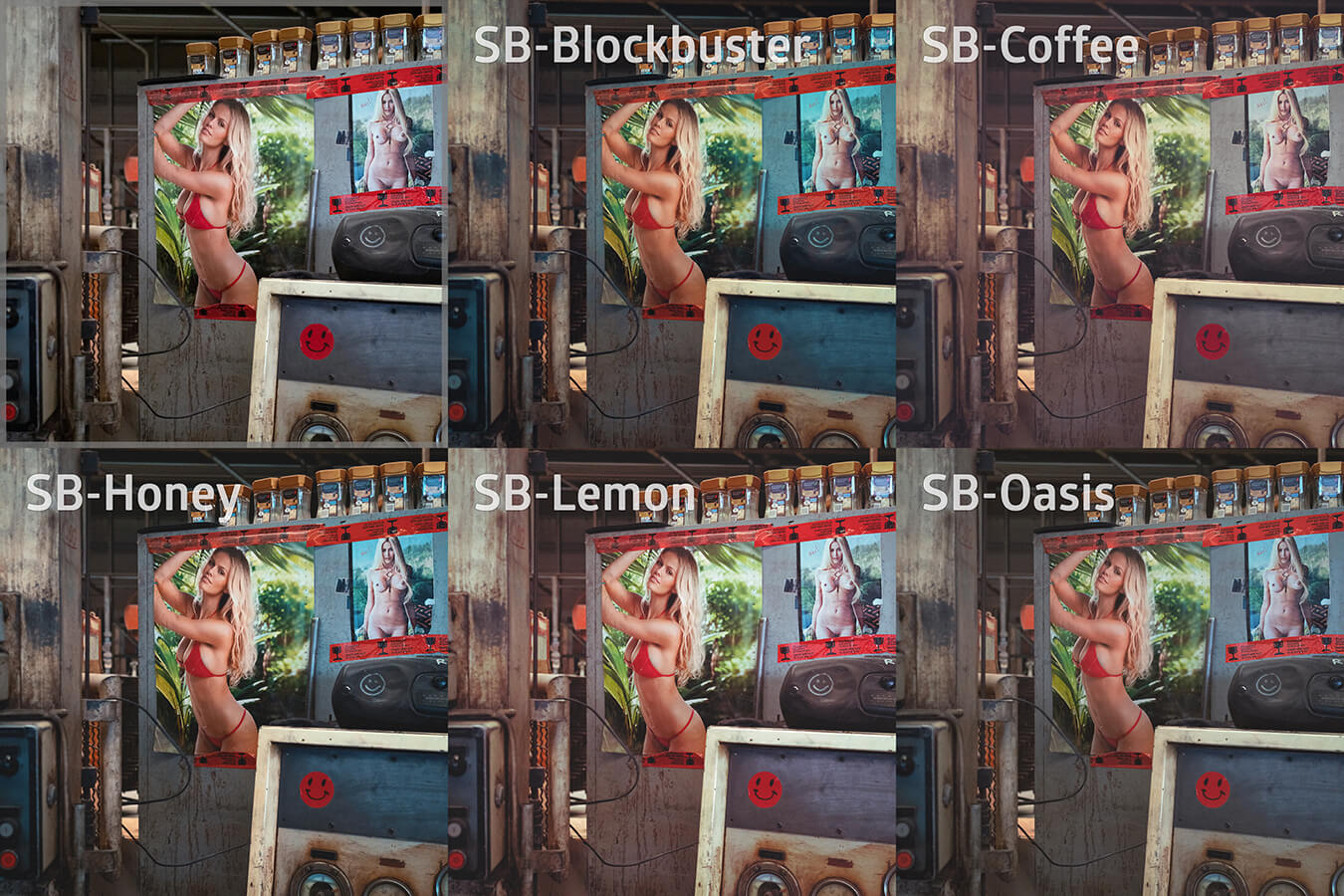
- Inspired by the complementary colors orange and teal that are so popular in big star cinema, skin tones become richer and more delicious, highlights and shadows get a subtle cyan cast. It's all very subtle, but clearly visible. Not as gloomy as in thrillers, but with a positive freshness. And just a classic due to the complementary contrast.
SB Blockbuster
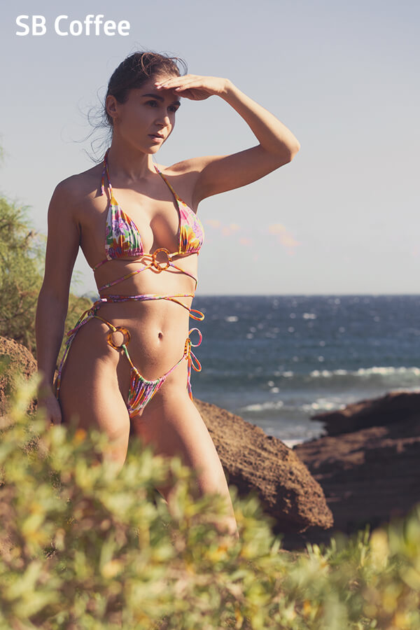
- Coffee has an incredibly beautiful color spectrum. From deep brown-black to a golden, nutty brown. Appetizingly, such a color spectrum lays over the image and creates a slight retro mood.
SB Coffee
- You always want to snack on these colors. A modern, contemporary look. Barely noticeable, with pleasant, clear white and a warmth despite an underlying cooler color mood. A grown-up image mood that takes advantage of the warm-cold contrast.
SB Honey

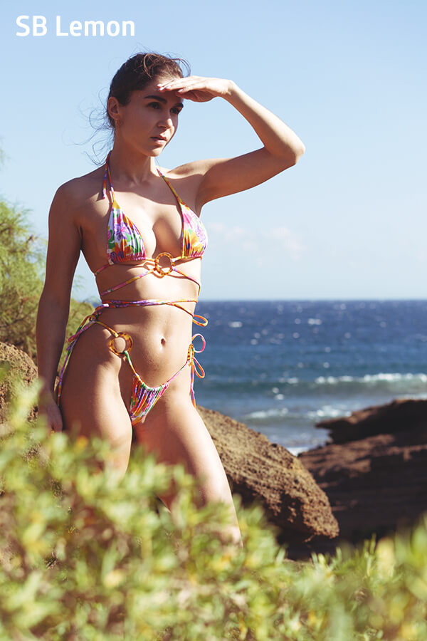
- Achieving rich summer colors without looking cheap is not so easy. So while the hues here are minimally stronger, the skin tones are only gently sunnier. Subtle, but noticeable. With a touch of nostalgia due to the reddish nuances in the depths.
SB Lemon
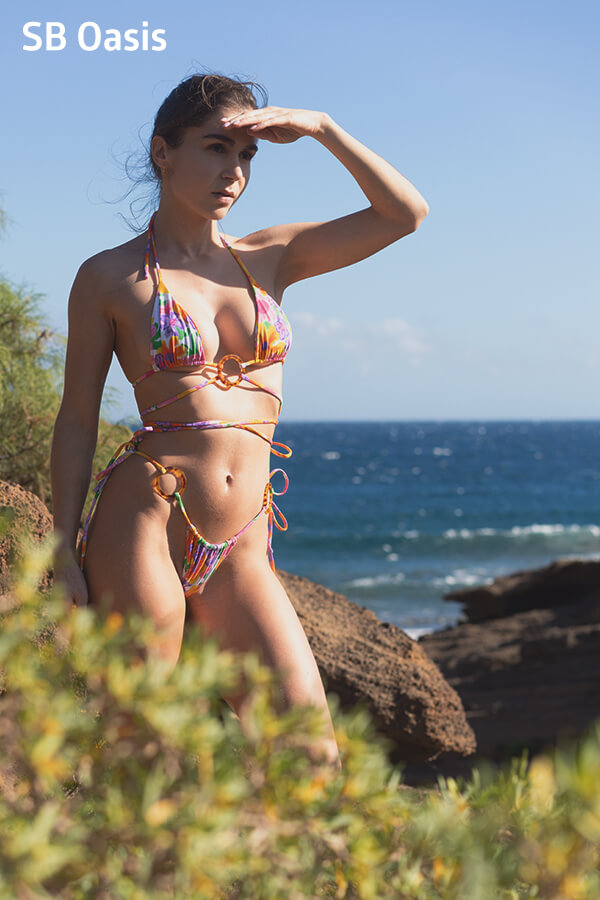
- There are difficult light moods, for example, with harsh light-dark contrasts on the skin. When skin tones need to be gently muted and contrasts need to be defused in a pleasant way, this cinematic LUT helps. It saves many images and provides a surprise effect in post-processing.
SB Oasis
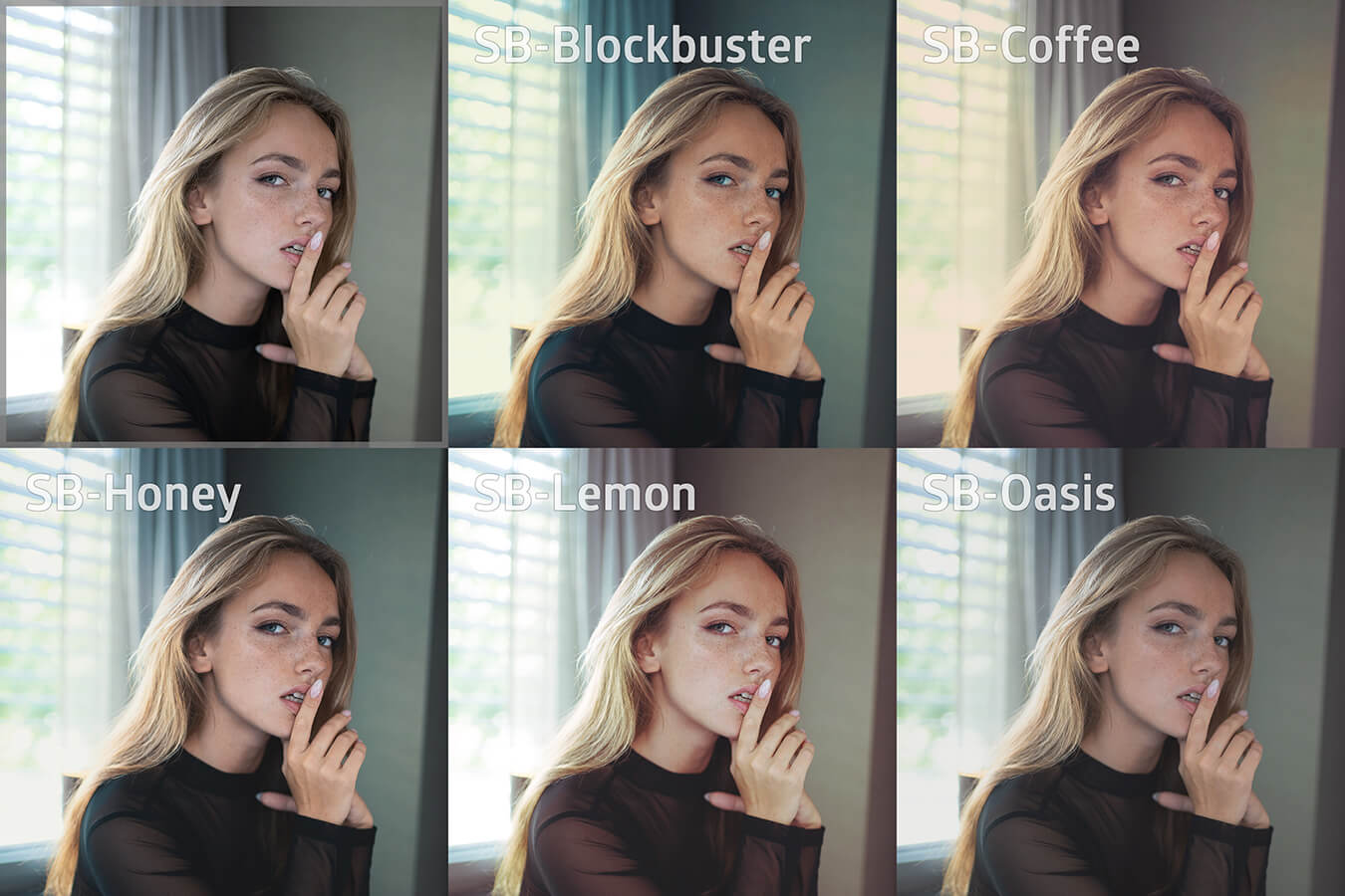
Here again all five LUTs as a preview
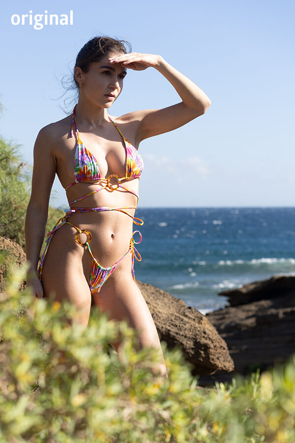
Hover over an image to see the underlying original image (it's always the same).
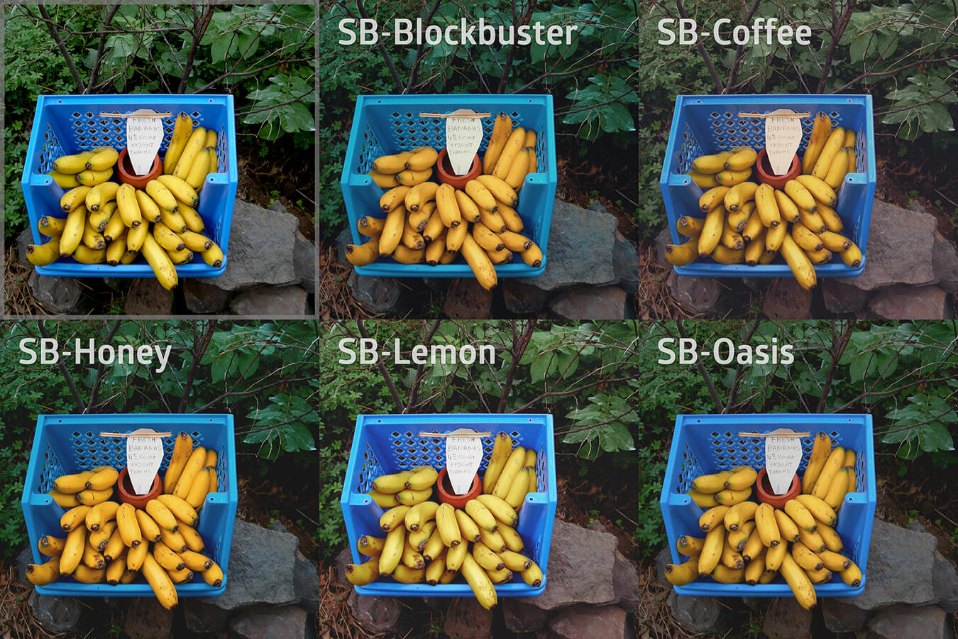
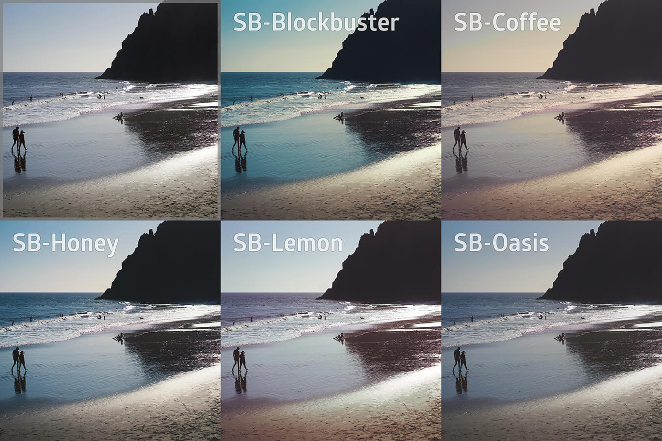
Here are 10 more examples
On the top left you will find the original photo in each case, next to it and below it the five different looks that my LUTs create. You can also download the example images here in large (3240x2160) as a ZIP (52 MB), so you can look at them more closely.
Have I promised too much?
If you see hardly any difference from the original image or between the individual LUTs, I take this as a compliment. It was my goal to achieve delicate and sensitive improvements in the interplay of colors and shading.
Test for free
FIf you are not yet convinced, feel free to email me one of your photos at and I will send you back the five color variations with my LUTs as a JPG.
Advantages
- Fast color grading
- Professional color looks
- Photos and videos in the exact same look
Disadvantages
- My LUTs do not replace the eye for good color design
- My LUTs do not include a black and white look
No theory:
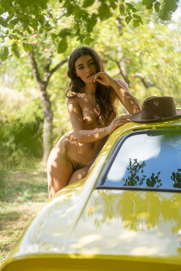
Here's a real-life application example from my production for Playboy Germany April 2023
I realized a production for Playboy, where I photographed the beautiful Katérina with a 1972 Opel GT in an allotment garden. For a photo I placed her in the shade of an apple tree, because the sun was too hard on skin and sheet metal at noon.
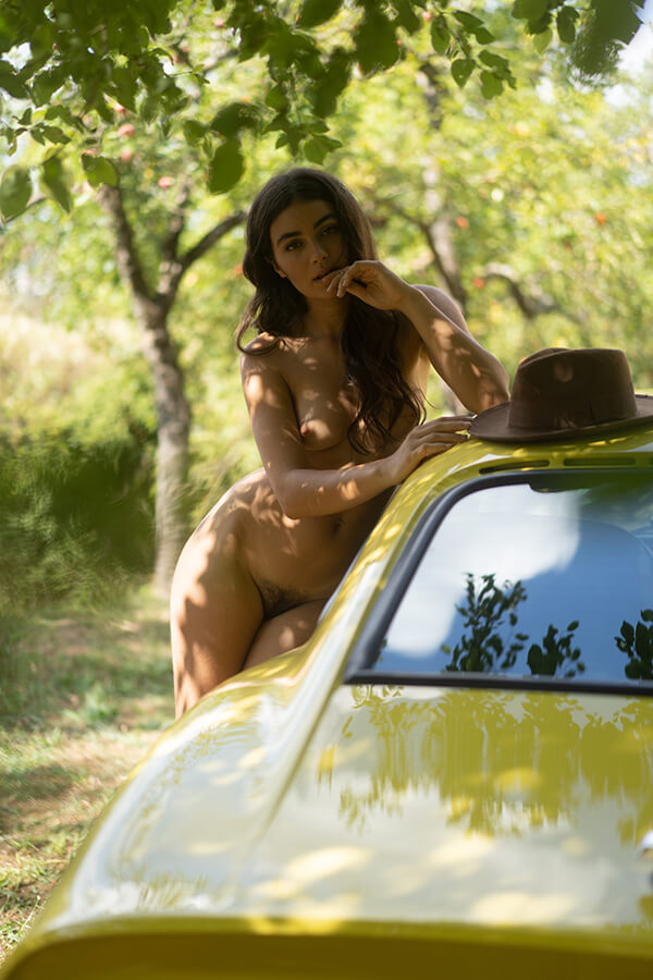
The photo is underexposed. I just wanted to make sure I didn't burn out the background, and I find it easier to lighten a darker image than to darken one that is too bright.
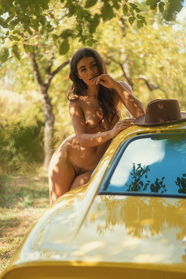
So I adjusted the brightness on the photo. This is how it looks then:
Now I clicked on my LUT SB Blockbuster and reduced the opacity to 80%. Done!
Install LUTs
Adobe Photoshop from version CC2019
The program should not be open. Unzip SB-LUTs.zip and copy the five files into an Adobe Preset directory.
Windows
C:\Users\[YourName]\AppData\Roaming\Adobe\Adobe Photoshop[YourVersion]\Presets\3DLUTs
On my machine, the path is:
C:\Users\Simon Bolz\AppData\Roaming\Adobe\Adobe Photoshop 2023\Presets\3DLUTs
I have deleted Adobe's in-house LUTs from the directory. You can alternatively copy my LUTs there:
C:\Program Files\Adobe\Adobe Photoshop 2023\Presets\3DLUTs
Macintosh
Unzip SB-LUTs.zip and copy the five files to:
/Applications/Adobe Photoshop [Version]/Presets/3DLUTs
Affinity Photo
Go to Layer > New Adjustment Layer > 3D LUT Adjustment. In the 3D LUT window that opens, click Load LUT and select one of the 5 LUTs.
Video software
You can also colorize normally recorded video (without flat profiles like S-LOG) with my LUTs. This can be done for example in Davinci Resolve, Adobe Premiere or directly in Adobe Photoshop.
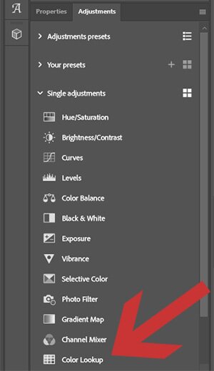
Using LUTs with Photoshop
Open your photo. It should be normally exposed and have a natural white balance.
Click on the LUT icon at Adjustments.
Select the desired LUT:
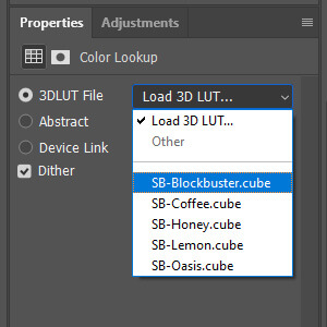
If the result is too intense, reduce the opacity.
-
SB LUTs
-
Five LUTs (SB Blockbuster, SB Coffee, SB Honey, SB Lemon, SB Oasis) for color shaping of normal photos and videos without special profile.
The LUTs are optimized for use in the sRGB color space. You need an image editing software like Adobe Photoshop CC2019 or higher or Affinity Photo to use the LUTs. It does not matter what camera you use.
99.90 €
Digital products are excluded from returns.
Buy LUTs
You can purchase my LUTs here and receive them immediately by email.
Your address is only needed to create the invoice.