In Adobe's Photoshop version 2023, some new presets have been added under Filters > Camera Raw Filters. As usual, many of them are a bit quirky and sometimes a bit arbitrary in their naming.
But because you can vary the strength of the presets with values from 0 to 200 percent, many of the filters are actually usable and no longer just a gimmick. Let's find out how useful the filters are.

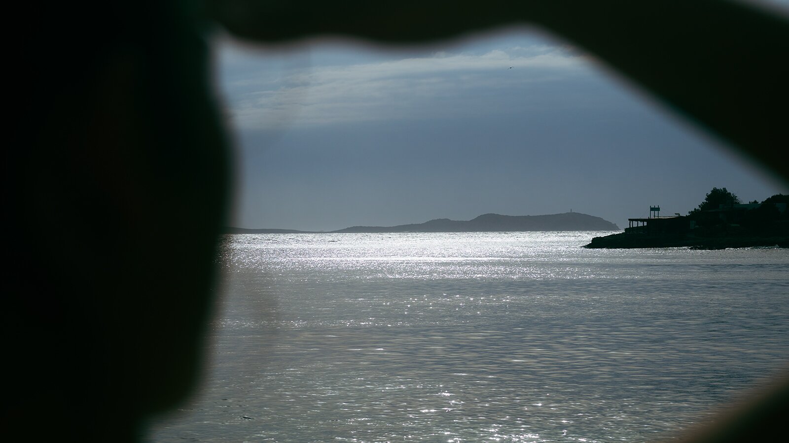
Here is my starting image, which I took in Ibiza. As always, of course, you have to consider what lighting conditions an image was taken in and what the model's actual skin tone was. In this picture Tezz had a bit of sunburn, but from my point of view you can't see that at all in my photo.

Adaptive: Portrait
It starts directly with new features, where face recognition takes place on different levels. For example, you can quickly create a portrait with more details. That means more sharpness and contrast — only in the face.

Several filters can be applied in one pass. Here I have also set Enhance Eyes (a brightening of the whites of the eyes) at 39% and more Texture Hair (sharpness) in the hair at 69%. Would I do this in practice? Probably not. But when I consider that in the past you had to highlight the whites of the eyes with a brush and manually turn up the brightness, this is already a blatant simplification.
We don't even need to talk about masking hair. That really works very well.


Adaptive: Sky
With Adaptive: Sky you can also easily adjust the color of the sky. This effect works well, but attention: The results actually always look too extreme. Here I would definitely recommend to limit the strength of the filter to low percentages, if this filter is used at all. I do not use it myself.
Adaptive: Subject
Here, an entire body is directly selected by the filter and you can change the color or soften the skin at a fingersnap. Where the Neural Filter is only limited to the face area, here you finally have a way to get the entire skin more even with one click. I would only recommend this if you need to do it quickly.
Otherwise, I have my own workflow in processing skin and work with much more care here. However, the Soft and Vibrant filters are still interesting. I would prefer Vibrant over Pop. But be sure to tone down the strength. n my example I overdid it a bit with 69%. In practice, I would probably stay below 50% in any case.
It is somewhat annoying that Soft and Vibrant cannot be applied together in one pass.


The terminology of the filters is a bit imprecise.
Even though it says Portrait in front of it, it's not just faces that are affected, but the entire image when changes are made.
Deep Skin, Medium Skin and Light Skin no longer contain suitable filters for me. That was different in old Photoshop versions. I liked to use Portrait: Medium 07 there. But they introduced grain to it in Photoshop 2023. Now I would have to manually set it back to 0% via Basic > Effects > Grain. You could of course also make your own presets. But what's the point in having a long preset list then?
Portraits: Edgy
In the new 2023 version, I could imagine Portraits: Edgy 03, toned down, for a nice 80s inspired look. Interesting, isn't it?

Cinematic
Most of the cinematic presets are strange. Many have a very deep black, which I don't know from the cinema. There, deep blacks are actually always lightened slightly. The CN 18 now also contains Grain (20%). But it would be my favorite.

I'd rather not say anything about the Futuristic filters. Apparently, the intern was allowed to experiment a bit here. They look way too artificial. Please do not use those filters. They are not from the future.
Subject: Lifestyle and Travel
Subject: Lifestyle is a strange term, but LS 03 works in toned down. It changes the tones a bit more to the yellowish side. Travel can perhaps also be applied, for example TR 04.


Surprise

My conclusion
Since many factors depend extremely on whether a preset is suitable, be it the lighting situation, the skin tone of the person or the desired end result, in the vast majority of cases it is easier to adjust the colors yourself. I would continue to take that time when processing photo series.
So I made use of Photoshop's Manage Presets offer in the top right corner of the tool and deselected most of the filters. My selection now only looks like this:

Which preset I would use again, I don't know. But it's worth knowing which ones you can test out in a hurry. It saves a lot of time when you spend some time with the presets list while not working on a real project. When not being under pressure. And knowing what these filters do.
For comparison reasons, this is what my final result of the processing (without using one of the presets) would look like:

If you say you don't see a difference and all of the above images look the same to you, I agree that this article is quite nerdy. Sorry!
I am aware that all adjustments and changes to the colors are very subtle. That's always important when making adjustments anyway. Always dial down the percentage a little after you found a suitable preset.
This way you can prevent your images from over-seasoning if you allow this comparison.