Actually, my approach is a lot more sophisticated. I never slap any finished look onto a photo and the color grading would be finished. Colors are extremely important to me and I spend a lot of time fine-tuning the colors in my photos.
That doesn't mean that I manipulate an incredible amount, just that I think very carefully about which colors should be a bit different so that the mood of the picture corresponds to what I want to say.
And that's what it's about to me: colors are never arbitrary, they convey a feeling. The viewer not only sees shapes, but also feels the colors.
For a short time Adobe has also integrated presets in its Camera RAW developer. I actually develop my photos with Capture One. But when it's just about a single image or when it needs to be quick, I regularly use Camera RAW. That's why I took a look at the new preset feature.
From my point of view, presets are useful if you can get a result quickly with them. But that's where it gets difficult with Camera RAW. Because there are 15 preset categories from Portraiture Deep Skin to Subject Urban Architecture. And in each of these categories there are around 10 variants with sometimes very different results.
If you have to try out almost 150 presets to achieve the desired result, you can safely ask whether working with a preset is actually faster. Isn't it more the laziness of just trying out instead of thinking about the color grading?
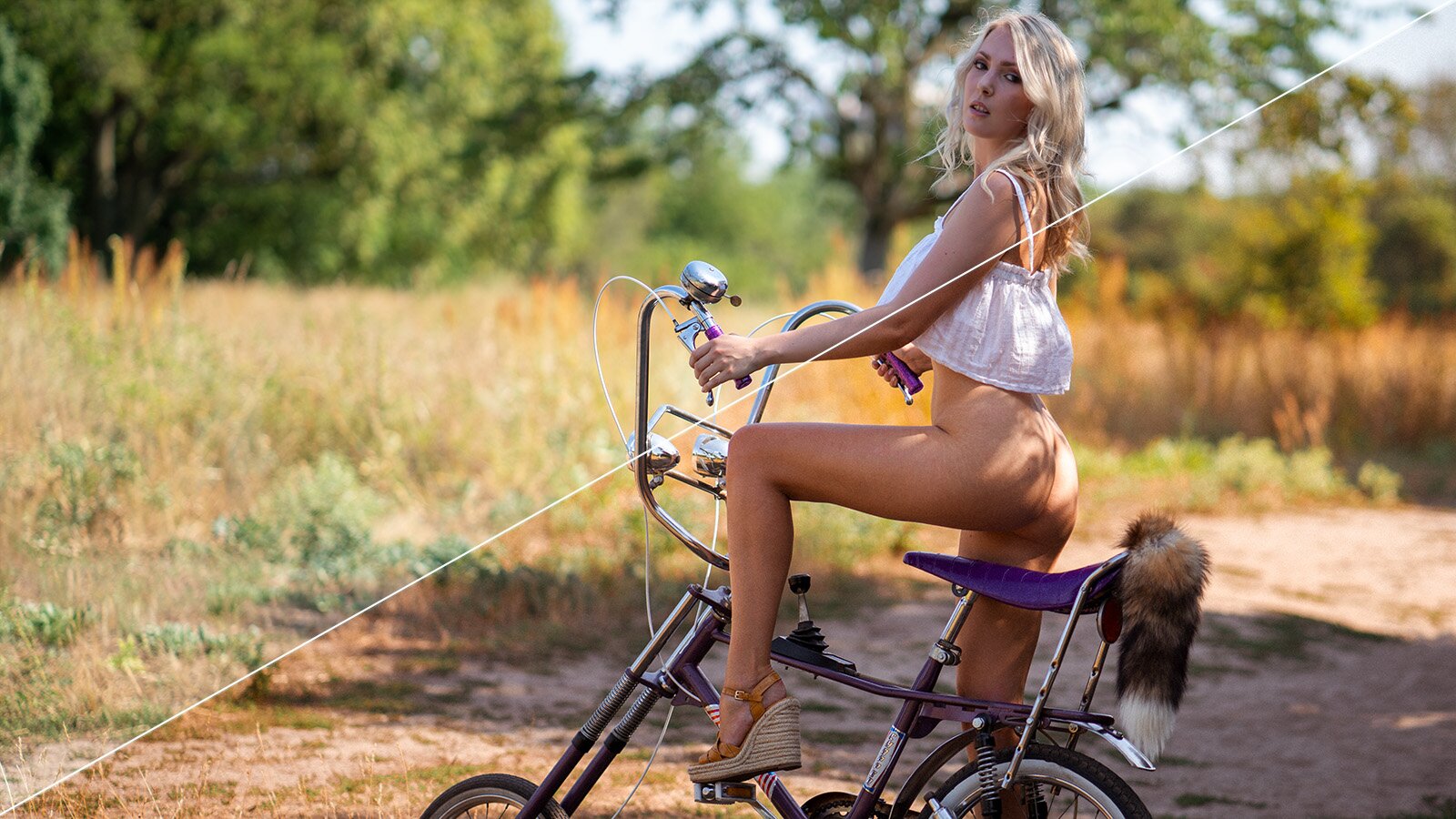
Original images (no presets)


Somehow I don't like that. Editing a picture randomly or adding any look. I am reluctant to do that. And that's why I tried all of the presets once with two photos. My photos were taken in nature in bright sunshine, one of them backlight.
In such scenarios (Germany, summer, model naked in nature) you can safely dump most of the presets in the bin. Many of them just look creepy. And most of the "Cinematic" presets don't look cinematic at all to me.
But I don't want to mess around, a few presets do work for me. They are called:
- Medium Skin PM07
- Auto+Retro AR10
- Style Cinematic II CN18
- Subject Food FD03
- Subject Travel TR10 (at 30% - 70%)


My favorite presets
If I was to name my favorite out of the above chosen presets, it clearly would be the Medium Skin PM07, because it results in green values that I like and the skin looks slightly warmer and more pleasing.
Style Cinematic II CN18 would be my second choice if I was going for a warm yet quite desaturated look. Subject Travel TR10 only works for me, if used between 30% and 70% strength.
Would I recommend using presets? Not really. Because they tempt you to rashly change any colors. In my opinion, this should be done consciously. For example, I know that the summery shades of green in Germany bother me. They feel too saturated and just too green. I do not like that. And that's why I take out the saturation and bring the hue more in a yellow direction.
The skin color looks more appealing from my subjective point of view with a little more saturation and a little more red. And that's the point: it's always a subjective point of view. And there are nuances. As long as we stay within a certain range, there is no right or wrong.