As you can tell from my works, I am a color person. Colors mean a lot to me. They set a mood and they are directing feelings. If you are responsive to colors like I am, you feel the smallest differences. I own a pair of sunglasses that I bought in Barcelona a few years ago. They look very normal and they are not fancy at all. But there's something about them that make colors pop. Only slightly, but driving through the city, the sky looks more blue and green tones feel warmer. To me those are instant feel good glasses.
From this point of view, taking away colors from an image sounds like a totally bad idea, right? You steal all the information that sets the mood. What's the point? Well, when removing colors, it's all about shapes and contrast. This is a different way of looking at things and as I like to look over the edge of the plate, here are some tricks for working with black and white images.
Black and White mode
It's possible to set the picture mode to black and white while taking images in modern cameras. They still record all the color information in the raw files. But when you are looking through the viewfinder as you are composing the image, you already see the world in black and white. This feels super weird, but it helps so much in seeing if you have enough contrast or if your shot simply looks boring.
So, in case you plan to shoot a black and white set, I encourage you to try this out like I did when working with Terez on the rocks.

As there still is all the color information inside the raw file, I first drag the sliders for the desired look of a colored photograph. This is really not a lot of work, but I set the color temperature, drag the exposure slightly up or down and lift the shadows a small bit, for example.
Now, the photo is developed and ready for Photoshop.
In Photoshop, I select Adjustments > Black & White. The given presets are usually a good starting point and I quickly browse through them to see what they do to the image. Sometimes Neutral Density looks good or you just push the Auto button and adjust the sliders slightly afterwards.


I decided to give the photo a little punch by using the preset High Contrast Blue Filter and then lowering the reds and yellows a small bit.
Afterwards, I wanted to change the overall exposure and make the whole picture a bit brighter. So I clicked on Adjustments > Exposure and set exposure to +0.12, offset to +0.001 (which lifts the blacks a tiny bit) and gamma correction to 1.28 (lifts the overall exposure).
Adding warmth
When printing high quality black and white art in a publishing house, you usually don't just print in halftone dithering or rasterized blacks. To add depth and power to the look, you overprint and mix in additional colors. For example black plus a defined pantone warm gray color.
I remembered this from the ugly sepia images that we printed in the academy when I was a student. This look feels awful and very old-fashioned though. But technical, this is the way to go.
So, set your image to grayscale (Image > Grayscale) and then Image > Duotone. Now, you can set a second color to be present with your blacks and whites. But why not use presets with pre-defined curves?
- Warm Gray 11 bl 2
- mauve 4655 bl 3
- Bl CG10 WmG3 CG1


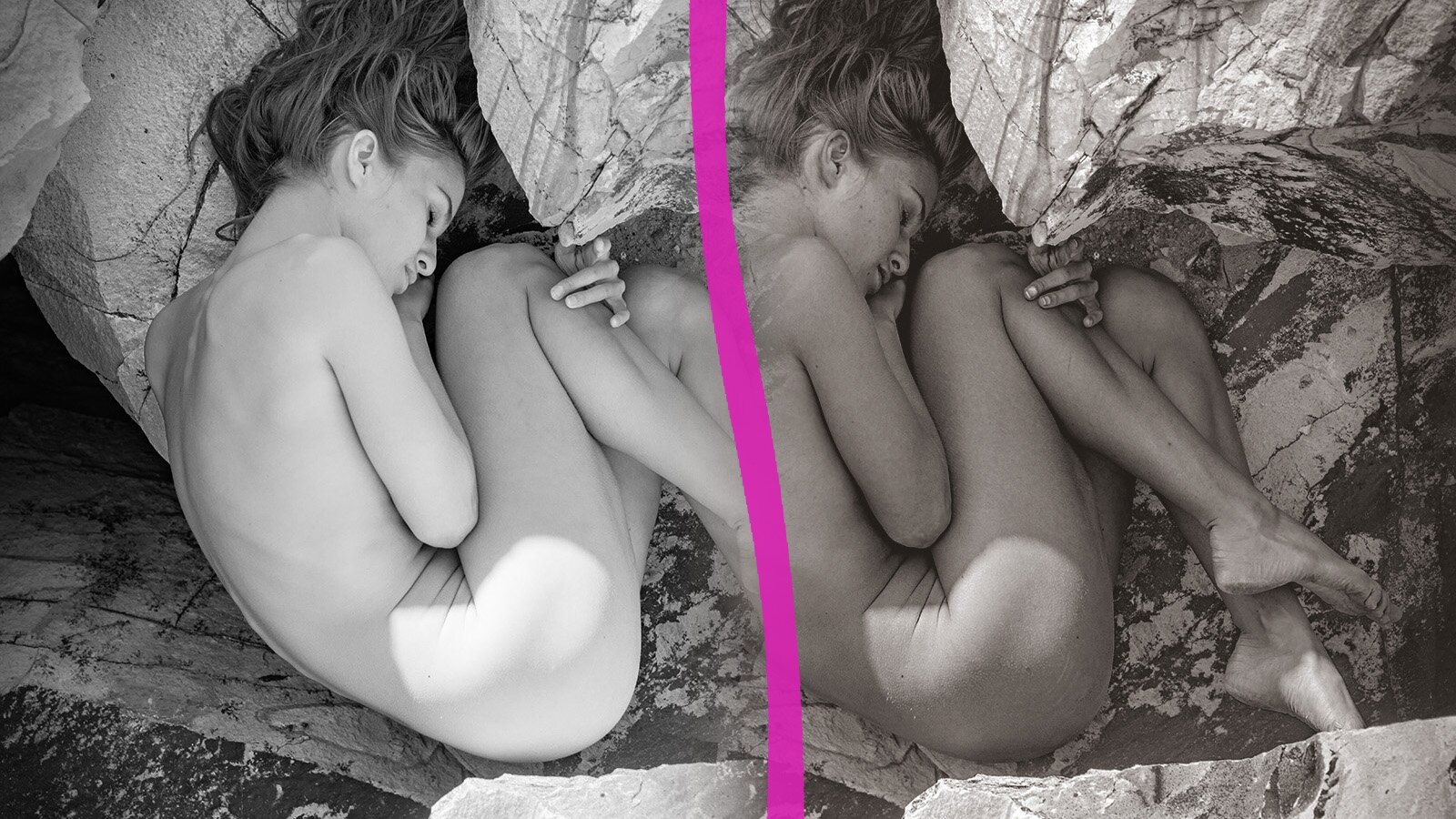
A richer black and white look


For a better comparison of the before and after, I have put the two version side by side, below. Now, it's easier to tell the difference.


But it hasn't become easier to tell which one looks better, right? I would say, the cooler grayscale version (before) puts emphasis on the rocks and the technical aspects of the black and white photograph while the warmer version (after) emphasizes the embryo pose more. You feel more hugged by this image and it still feels like a black and white photograph.