Gradient maps are a part of Photoshop for a long, long time. It took me a while to understand how to use them for color grading, though.
Mostly because you sometimes see people overdoing it. Even in some movies, the teal and orange blockbuster look is extensively exaggerated.
How to use Gradient Maps in Photoshop
- In the adjustments window, click on gradient map.
- Select a color for dark tones on the left and a color for light tones on the right. For example a blue for dark tones and an orange for light tones.
- Now give this layer a soft light and reduce the opacity to a value around 20 - 50%.
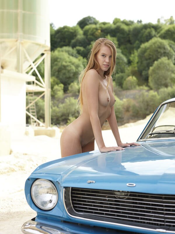
The colors look just a bit flat. Besides that, the image looks fine to me.
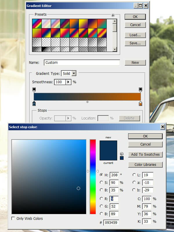
Adding a gradient map in Photoshop using a blue to orange gradient.
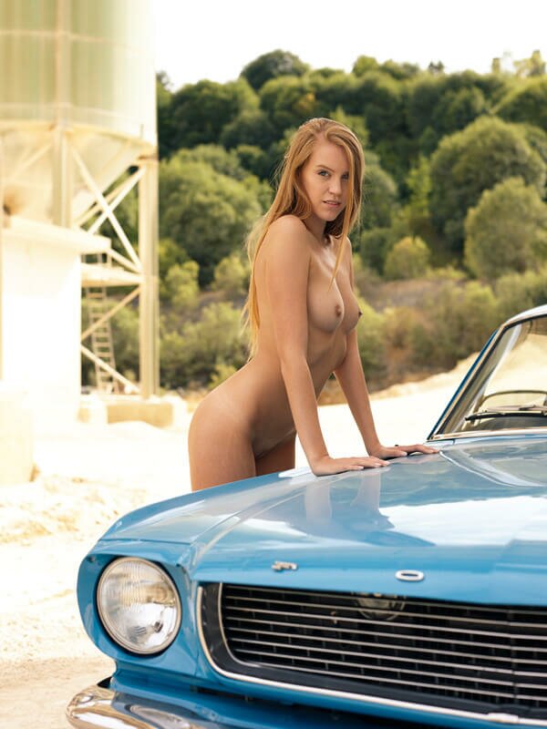
With soft light and an opacity of 40%, the blue to orange tones (from dark to light colors) add a pleasing bit of warmth to the look. No further adjustments were made.